Case study:
Mood Magic App!
Role: UX designer, leading the app and responsive website design from conception to delivery.
Responsibilities: Conducting interviews, paper/digital wireframing, low/high-fidelity prototyping, conducting usability studies, accounting for accessibility, iterating on designs, determining information architecture, and responsive design.

Project overview.
— The Challenges
Children sometimes have a hard time letting go of their stresses, anxieties, and lack of focus on studying and suffer from panic attacks and mood swings.
Most parents are working and trying to focus on making money for a living and don’t have much time to show their children how to deal with their emotions.
— The Goal
Mood Magic can help children understand feelings, learn what causes the feelings, and how to manage their feelings. It also helps to reduce and improve mood, attention, and focus.
— The Target Audience
7-16 years old who have hard time to handle their own anxieties and willing to find help.
User Research Summary.
I used Mood Magic data on daily mood swing data to develop interview questions, which were then used to conduct user interviews. Most interview participants reported feeling bad about their emotions shift often during the day and don’t know how to reduce the anxiety and panic, but they didn’t actively try to reduce their own feeling. The feedback received through research made it very clear that users would be open and willing to work towards eliminating emotions if they had access to an easy-to-use tool to help guide them.
Personas

— Problem Statement
Clair Clair is a 3rd-grade student who needs friends to play with after school because she thinks her older brother was mean to her.
— User Story
I wish I can have someone to play with me every day.

— Problem Statement
Jack is a 6th-grade student who needs his dad to go easy on him because he feels frustrated when his dad has high expectations of him.
— User Story
As a student, I still learning. I will be happier if my dad goes easy on me and doesn’t push me too hard.
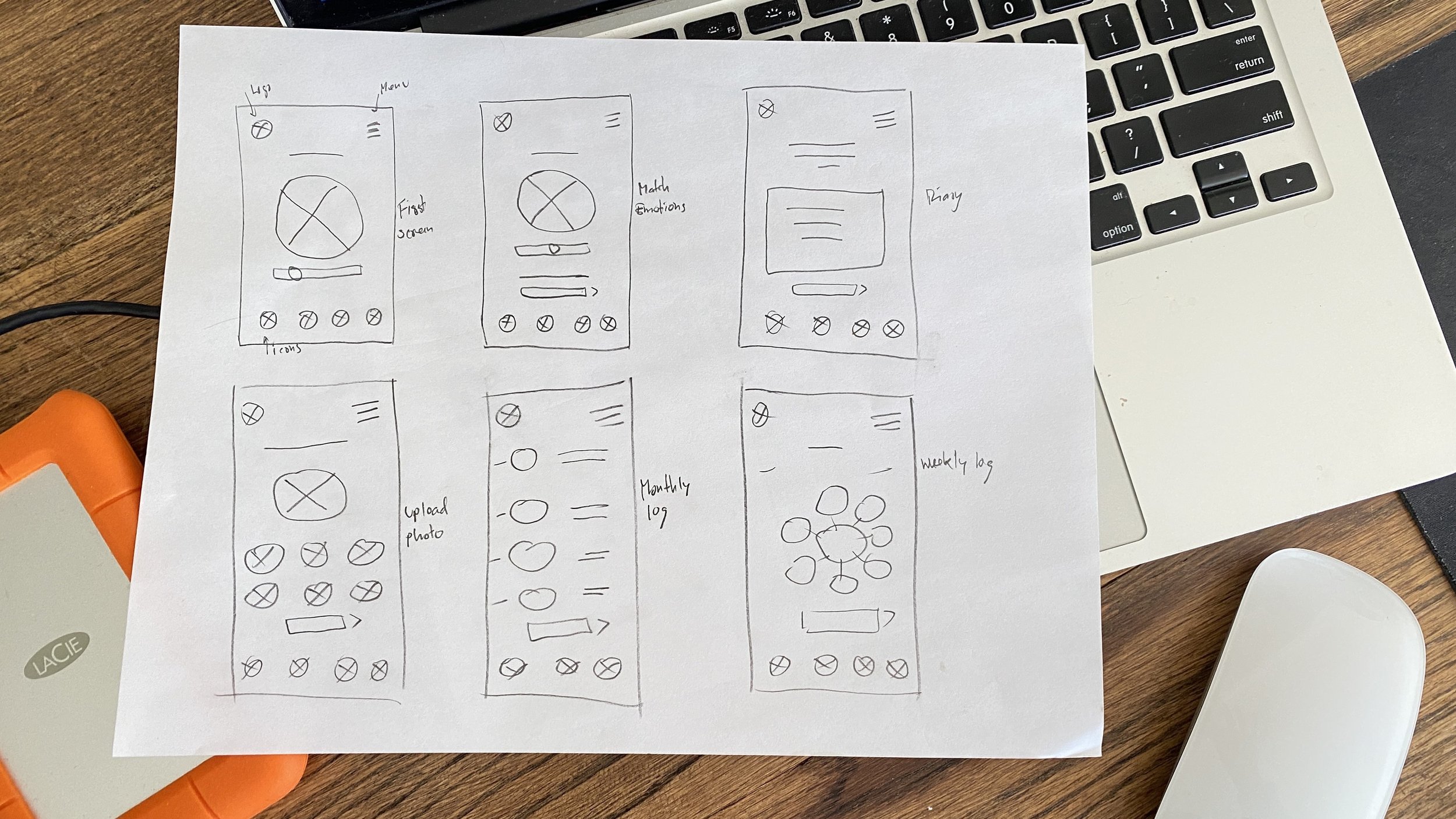
Paper Wireframes

I sketched iterations of each screen of the app on paper ensures the elements that made it to digital wireframes would be well-suited to address user pain points.
Digital Wireframes
After ideating and drafting some paper wireframes, I created the initial designs for the Mood Magic app. These designs focus on children’s emotions and options happens on each day.

Low-fidelity prototype
To prepare for usability testing, I created a low-fidelity prototype that connected the user flow of mood matching and tracking to causes, charts, and mood summaries.

High-fidelity Wireframes

Usability study: parameters


Usability study: findings

Mockups
Based on the insights from the usability studies,
I applied design changes like providing more emotional images by adding a slide bar to match the users’ feelings.
After usability study
Before usability study


High-fidelity prototype
The high-fidelity prototype followed the same user flow as the low-fidelity prototype, including design changes made after the usability study.

Accessibility considerations

Information Architecture/Sitemap
With the app designs completed, I started work on designing the responsive website. I used the Mood Magic sitemap to guide the organizational structure of each screen’s design to ensure a cohesive and consistent experience across devices

Responsive Designs
The designs for screen size variation included mobile, tablet, and desktop. I optimized the designs to fit the specific user needs of each device and screen size

Takeaways
— Impact
Users shared that the app made them feel like friends and they could actually help reduce their stress and anxieties. One quote from peer feedback was that “I felt great after tested it and want to use it every day”
— What I learned
I learned that even though the problem I was trying to solve was a big one, diligently going through each step of the design process and aligning with specific user needs helped me come up with solutions that were both feasible and useful.

